eCommerce based Tea company
A Public Benefit Organization that empowers everyone who works for it, to produce sustainable and authentic Nepali tea approached us for a design overhaul.
Nepal Tea initially approached us for a variety of different design needs. We initially rebranded their logo giving it a modern touch whilst also maintaining the Himalayan feels they had in their existing logo. After that we designed the packaging for the reserve tea series and then headed over to the website.
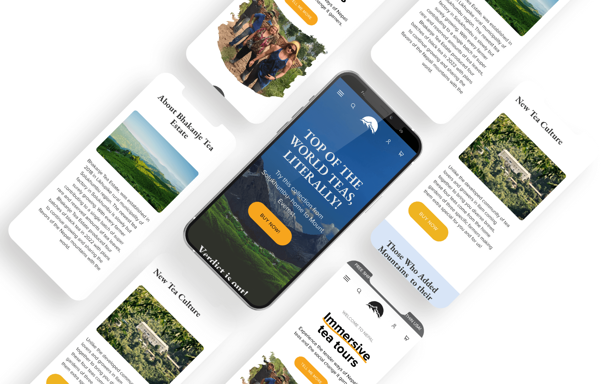
Black Dove was tasked with providing a massive overall uplift to Nepal Tea’s existing brand image, website and packaging design. The challenge was to create timeless designs that felt modern and represented the Nepali heritage that the company has. The solution was to design a website that appealed to all stakeholders involved in the tea production chain and to create packaging designs that embodied the company's values with the help of various art forms.
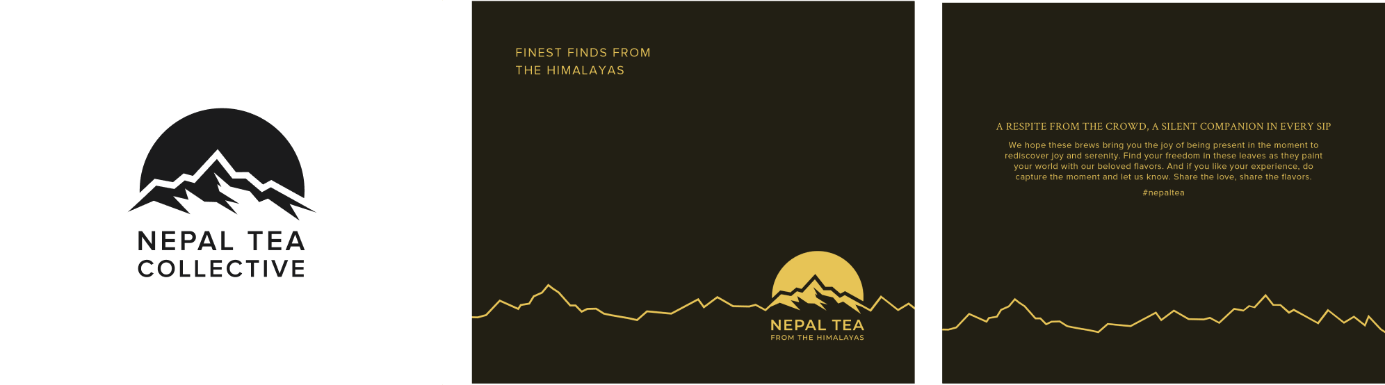
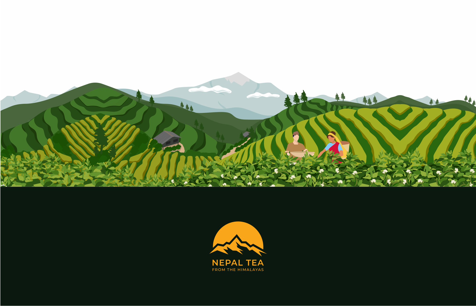
On the rebranding side, we drafted logos with the Himalayan range incorporated in it. We included Mt. Kanchenjunga’s silhouette in the logo as Nepal Tea’s garden is called Kanchenjunga Tea Estate.
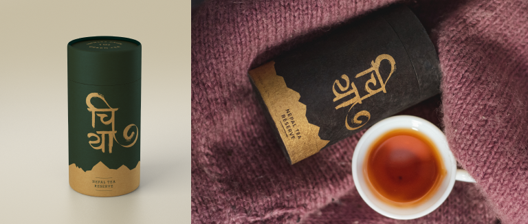
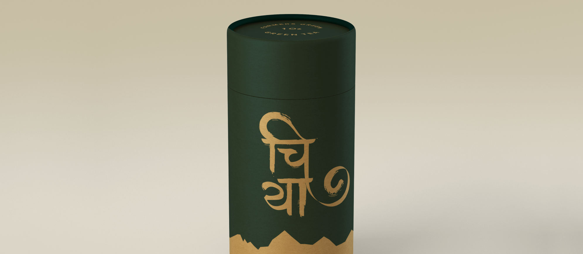
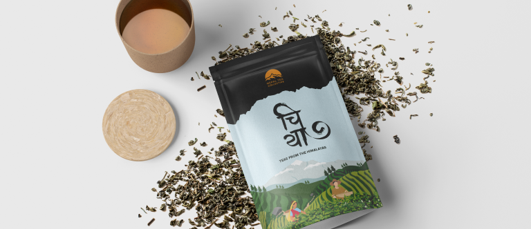
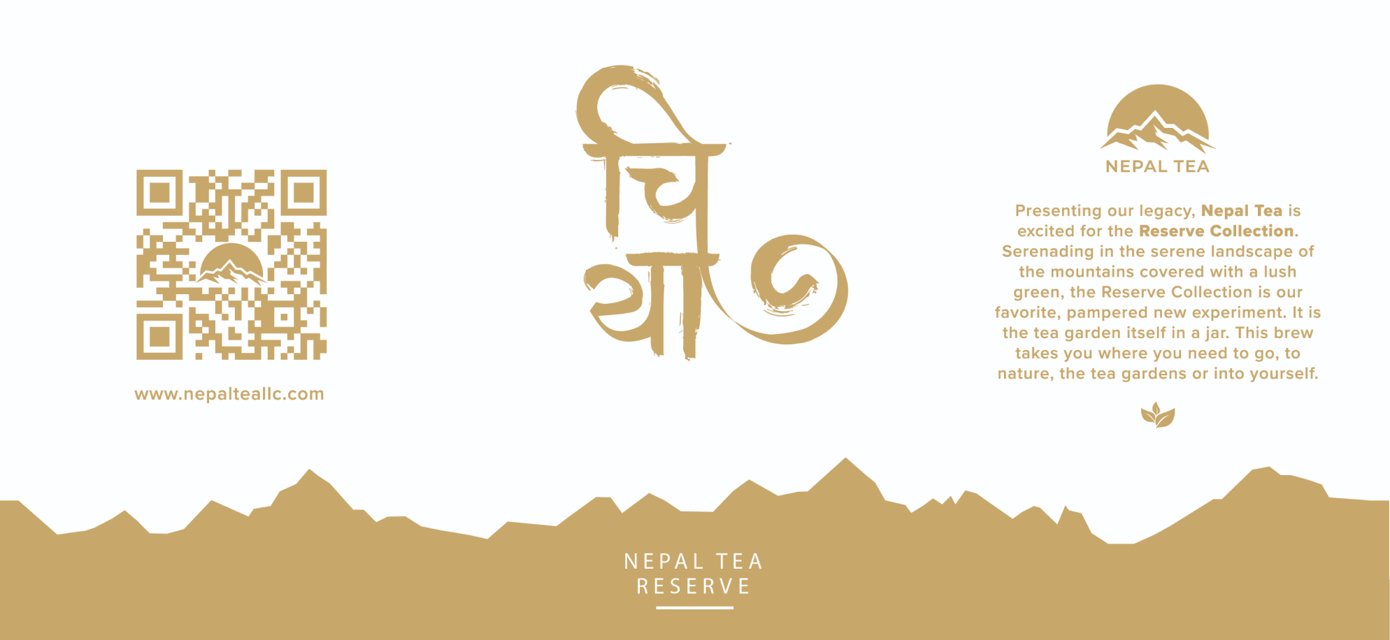
On the packaging aspect, we played around we a lot of designs and eventually ended up with the “lokta” paper box displaying proudly the chiya mark we designed for it.
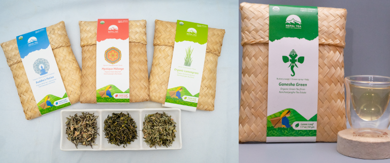
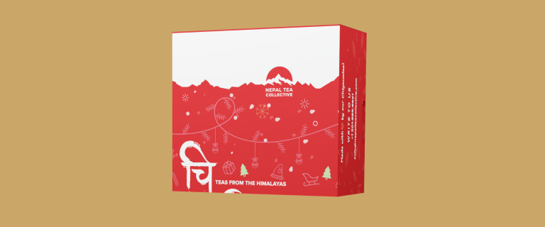
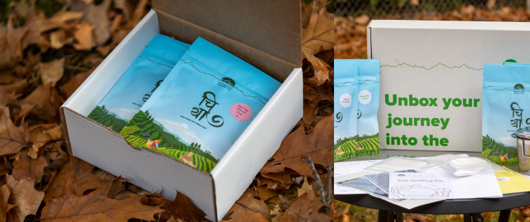
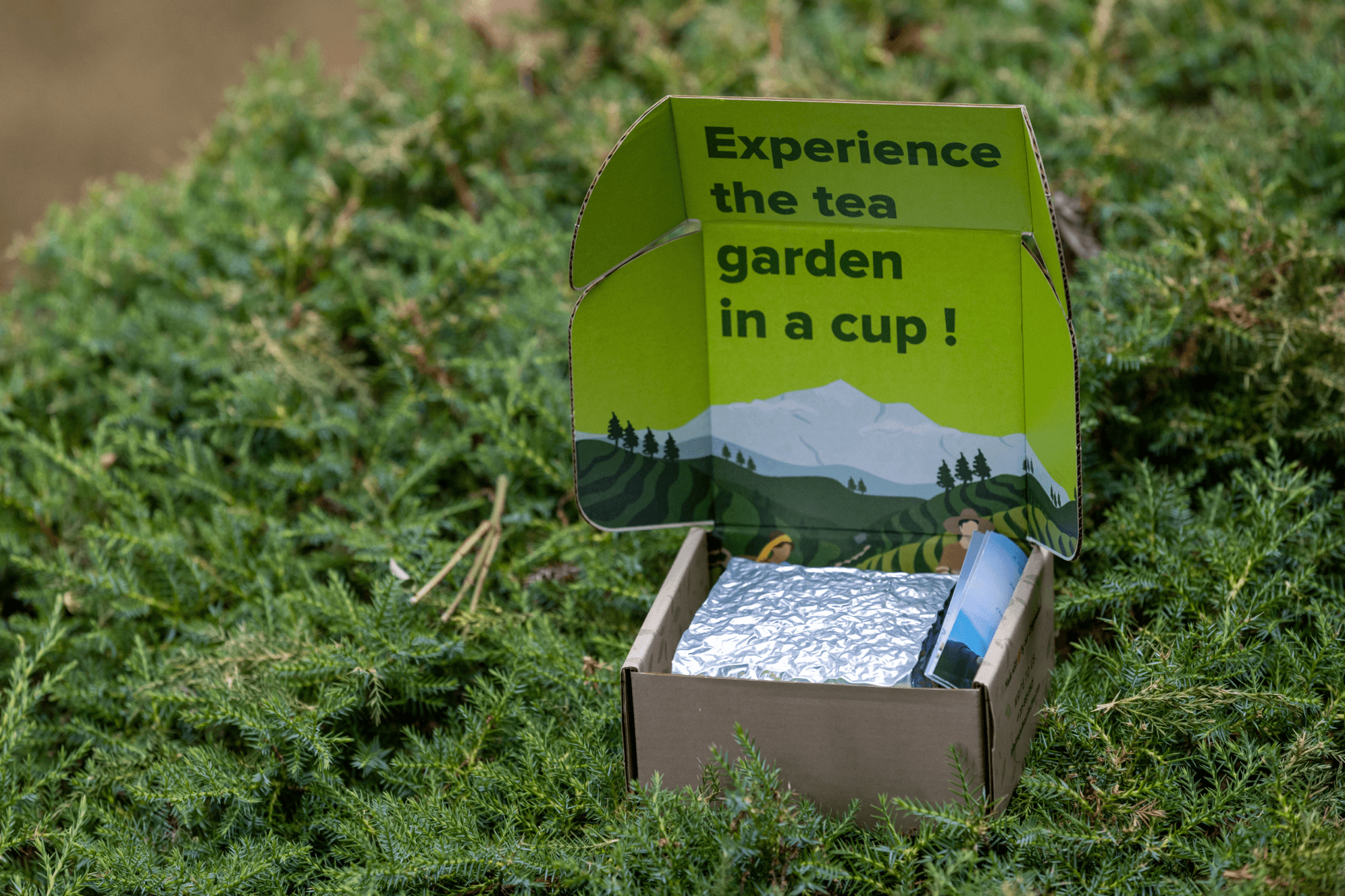
We also revamped their existing choya label boxes giving it a design uplift and now we’ve also designed various other packaging like tea tasting package, holiday packaging and various other packages.
After the design refresh, we’ve seen a 25% on initial launch and 40% increase in sales after 6 months across the website. The overall UI UX of the website and the products has been improved which has resulted in increased sales and user engagement. From the first look at the package to buying experience in the website and the information structure in the website and the package itself is consumer friendly and easy on the eyes.
Our task was to give Nepal Tea a massive design overhaul, while still preserving their core values, in order to appeal to a broader audience in the tea market. This involved revamping the entire lineup of the company's collateral.
Branding Rebranded the logo incorporating Mt. Kanchenjunga silhouette and added the Kanchenjunga range as a brand element to be used in various collaterals
On packaging side, We began by giving the choya label a makeover, keeping its authentic Nepali feel intact.
In order to carry on the Nepali vibe, we then came up with Reserve Tea packaging which featured Nepali typography as main design and used locally sourced paper. As a result, it was lighter than the previous packaging allowing the export cost to be cheaper.
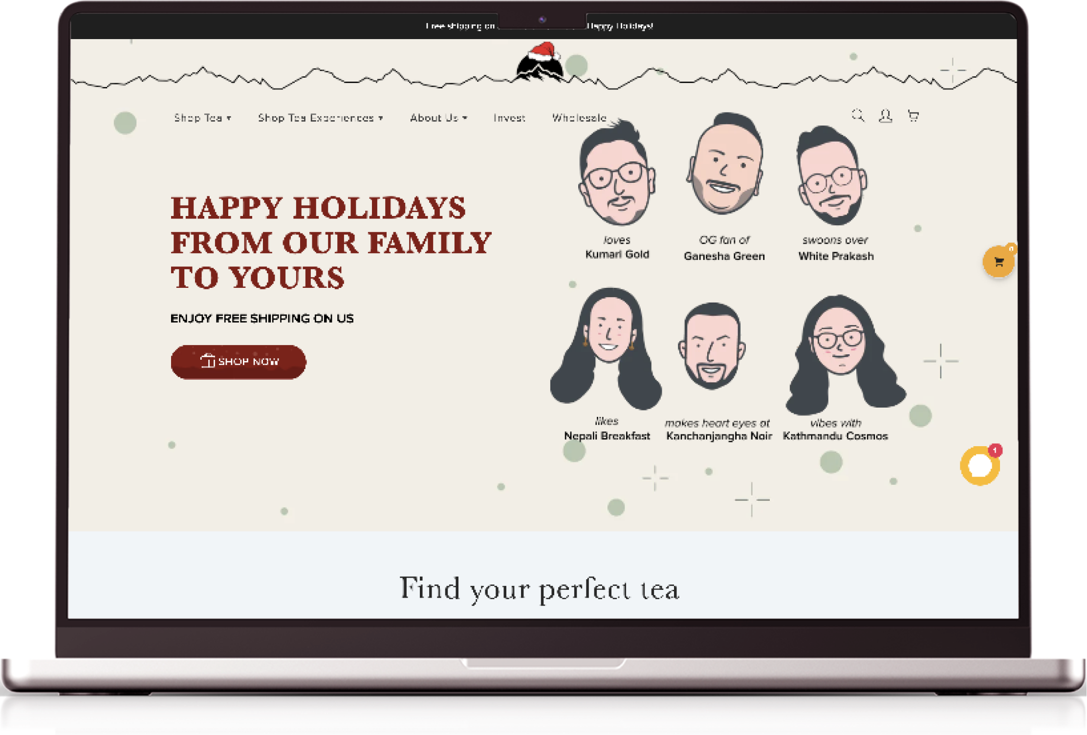
Next up was a design which we called within the team as “Generic Box”. Contrary to the name though, the box featured a heavy illustration of the Kanchenjunga Tea Estate carrying the iconic Nepali typography featured from the previous packaging. Adding to the lineup, we also designed Holiday package to celebrate Christmas along with Tea tasting package that was to be sent out with the complete tea tasting kit of the company.
Improved the overall experience of users coming into the website with an updated look and improved user experience so that users have an easier time navigating through the array of products across the website and has an simpler guide to which tea would fit them perfectly.