Information technology company
Equicom is a dynamic, technology-driven organization that provides excellent customer experience in the fields of healthcare, financial services, and information technology. Equicom has a diverse portfolio and is a culturally rich company.
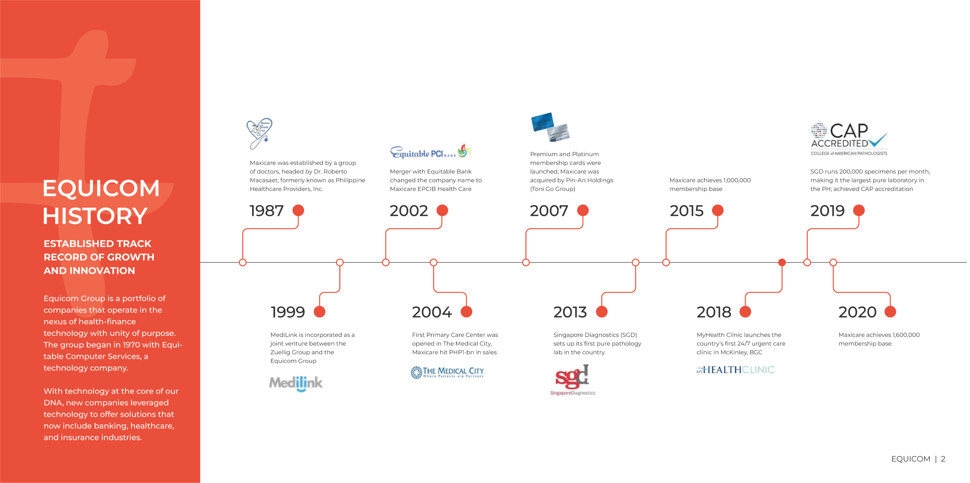
Black Dove had previously worked on brand identity projects for one of Equicom’s subsidiary companies. Equicom was looking to re-establish their brand and asked us to make a new Brand Book for them. The Brand Book would act as an all-embracing document that introduces and explains the history, values, goals and the grand picture of Equicom as a brand.
We were requested to create a comprehensive Brand Book for Equicom. The key purpose of the project was to establish a clear and cohesive visual identity for their brand and its subsidiary companies, rooted in the values of wellness, culture, and diversity. Our goal was to develop a brand that not only accurately represents Equicom's mission and vision but also resonates with their target audience and helps them to stand out in their respective industries.The Brand Book would reimagine their brand around the idea of wellness and set brand foundations for the organization. It would also help streamline the brand. On realizing the need for separate visual identity guidelines, it was planned that a Brand Style Guidelines document would be designed as an extension to the Brand Book.
We started the project by researching other brand books and how conglomerates like Equicom carried their brands in subsidiary companies. Equicom also needed a general visual solution to show that their subsidiary companies belong to The Equicom Group. Research and dialogue with Equicom led us to devise a simple descriptor that would be appended with subsidiary company logos.
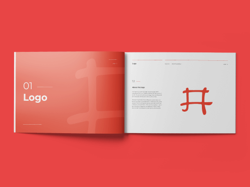
The Equicom Group logo takes its inspirations from the Chinese character 井. The character 井, which translates to well, was shaped from the physical appearance of a well. Since the logo has a meaning rooted in Chinese history and it represents Equicom’s values, we used the logo mark as a visual element throughout the brand book.

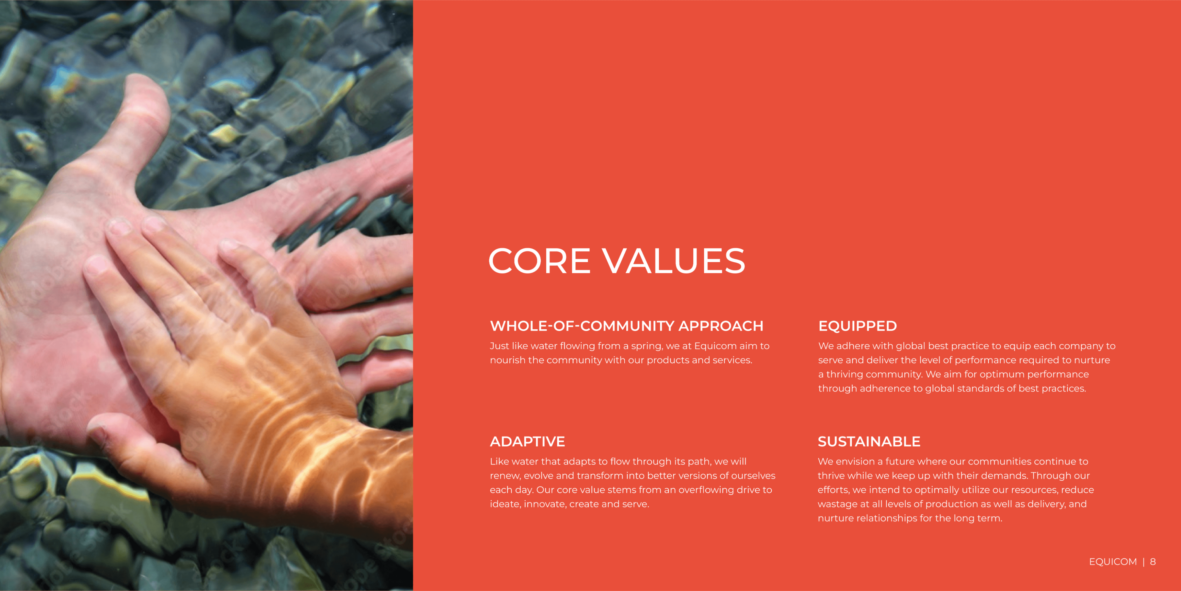
Equicom has a broad portfolio boasting leading companies in the fields of health, technology and finance. Imagery is a key element of a brand’s visual identity. Pictures conveying warmth, happiness, health, success and wellness were carefully curated to put Equicom in the hearts of the people.
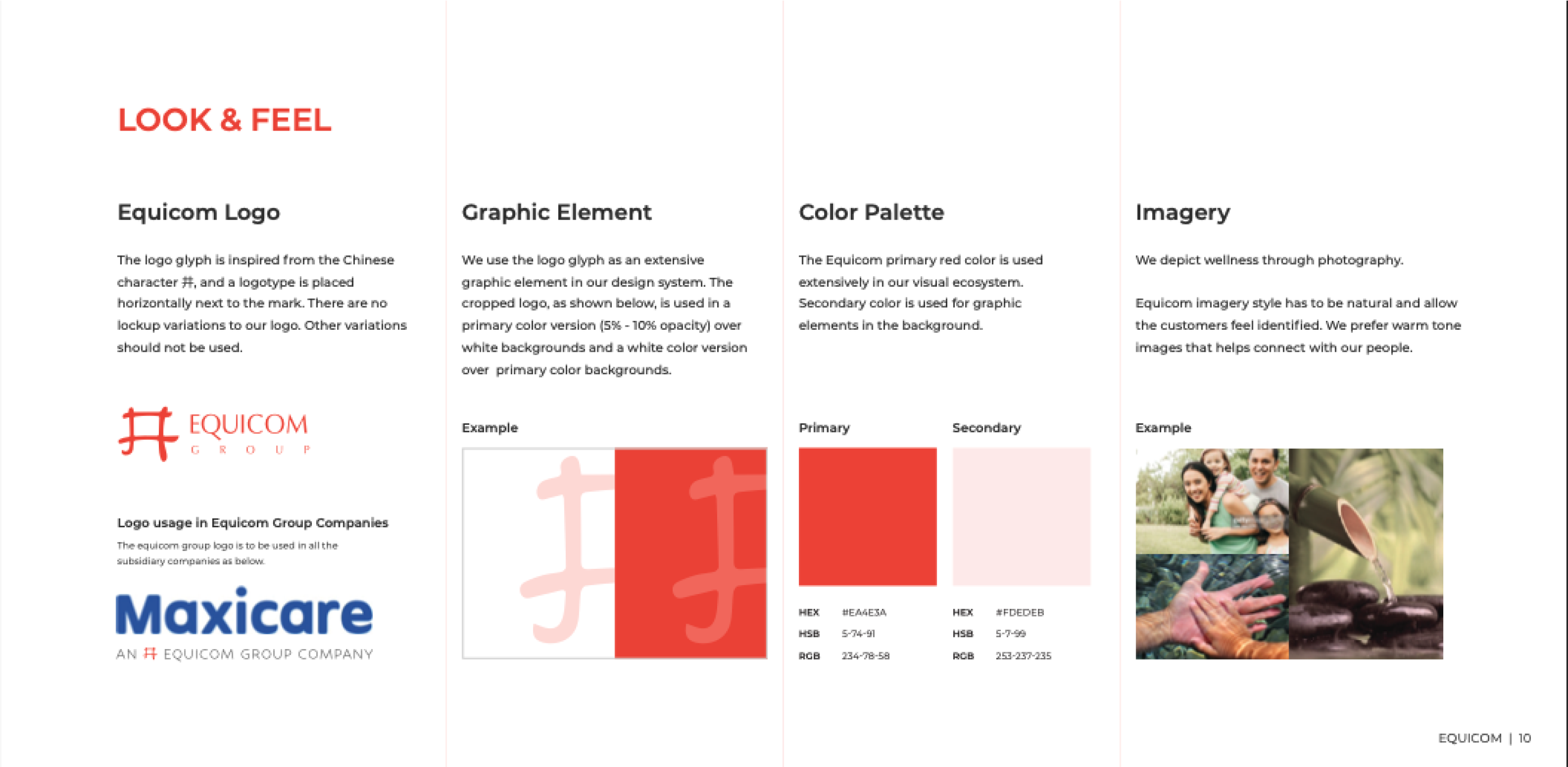
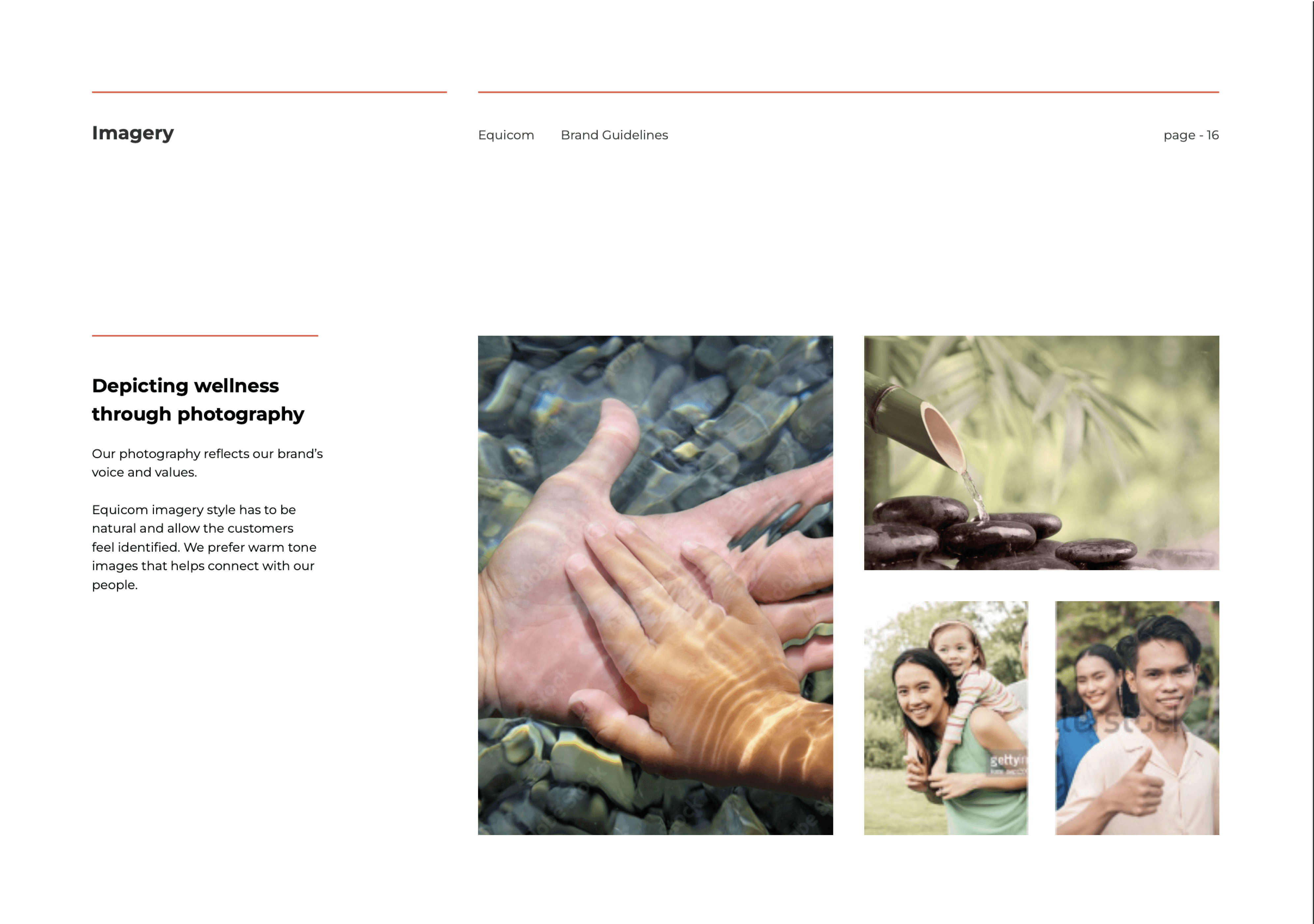
Equicom has a broad portfolio boasting leading companies in the fields of health, technology and finance. Imagery is a key element of a brand’s visual identity. Pictures conveying warmth, happiness, health, success and wellness were carefully curated to put Equicom in the hearts of the people.
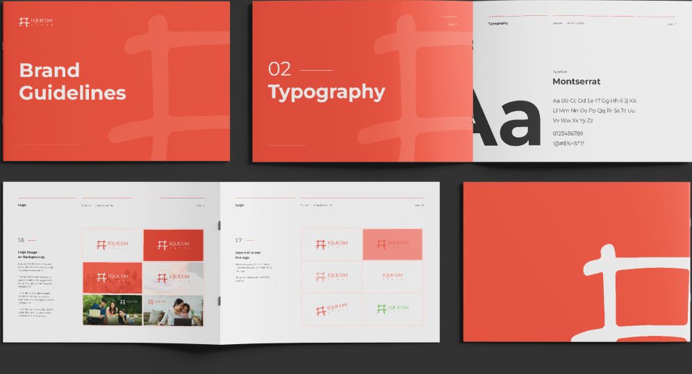
The descriptor text we designed would be used on all of Equicom's subsidiary companies.
The brand book would serve as a key document to cement and extend Equicom as a brand rooted in wellness, culture and diversity.
An extension to the brand book, the brand guidelines is a technical document that defines and shows the details of how visual implementations are to be made for future uses.